Brush-script font for titles and graphics
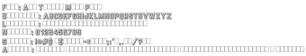
All Things Must Pass, by All Things Must Pass, is a script font created to provide display lettering for desktop designs. It supplies glyphs for short, decorative text and headlines, delivered as standard font files for direct use in desktop editors. The set targets graphic designers and hobbyists who need stylized titles for invitations, social posts, and digital art, offering quick typographic flair without complex installation steps.
What does the font add to desktop typography?
The font applies a handcrafted, brush-textured look to display text, orienting it toward titles and single-line headings rather than paragraph content. Included characters support common display uses: uppercase and lowercase letters, numerical digits, and basic punctuation. Typical uses include invitations, social-media headers, poster titles, and decorative labels where a textured, organic letterform is preferable to system faces.
How much control does it give over typographic variation?
The delivered files present a single stylistic set, so most variation comes from the host editor rather than alternate glyphs. Designers adjust appearance with size, tracking, color, layer effects, or application-level styling to change contrast and emphasis. The supplied set does not extend typographic control through multiple built-in weights or advanced alternates in the distributed edition.
Is it straightforward to install and use on a PC?
Installation follows standard desktop font procedures: after extracting the package, users add the font to the system and it appears in application font menus for editors such as Word and Photoshop. Once installed, the font behaves like any system face, selectable inside text tools and compatible with common desktop workflows that accept custom fonts.
What practical limits should designers expect in projects?
The distributed edition commonly provides a basic character collection, so extended punctuation and wide language support may be limited. Because the face targets display text, designers should avoid long continuous passages and reserve it for short headlines or decorative spots. Test character coverage before committing to multi-language or text-heavy layouts to confirm required glyphs are present.
Who should use this font and what to watch for
The font suits designers and hobbyists who need a handcrafted display face for personal and portfolio work; the version circulated on DaFont is restricted to personal projects, and commercial use requires a separate license from the author. As a practical tip, test the face at intended headline sizes and manage it with a font manager so downloaded files remain organized across projects.